iOS App
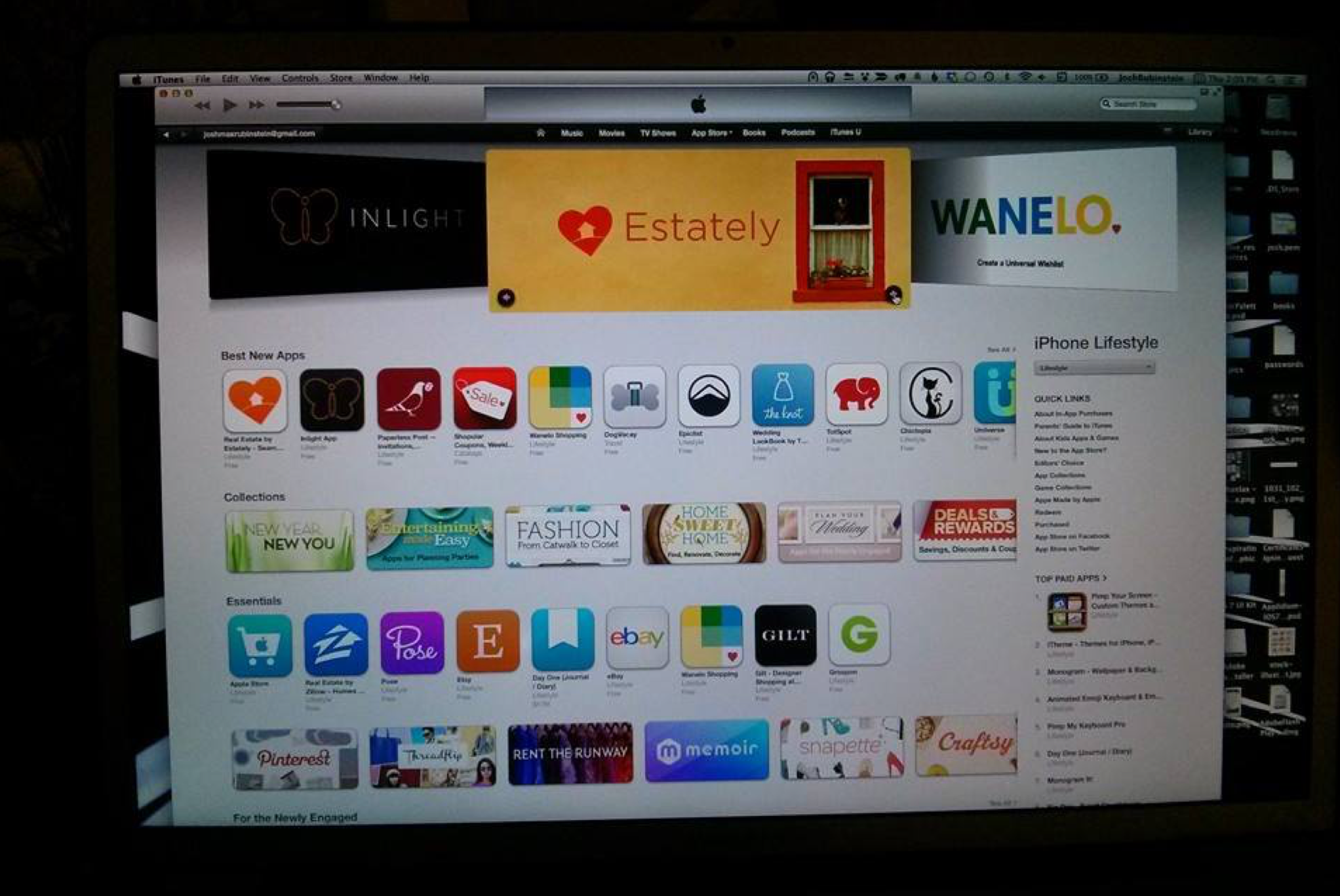
Beginning in 2006 Estately, a two person start-up run by Galen Ward and Doug Cole, sought to list every MLS home for sale. In time Estately's MLS coverage went from regional to national. Estately had solid SEO rank and a unique approach to helping home buyers shop for and tour homes. The momentum was there to take on the challenge and commitment to an Estately iOS app.
Unlike most other iOS apps in the real estate space, Estately did not have a legacy to inherit.
Designing and building an app for Estately meant not only leveraging the exciting iOS platform and hardware but also a chance to rediscover the brand and connect with a wider audience.
Context
A new approach to agile design and development
Prior to 2013, the Estately engineering team (design included) had always been releasing small incremental improvements daily. Pending a Github code review you deployed and moved onto another feature or bug fix.
Designing and developing for iOS required a new mindset for product development. Extra time was taken to explore, prototype and reconsider the on-boarding flow. Now that we were not the gate-keepers of each release a new layer of scrutiny was required.
The team was small. One designer and one Rails developer learning Objective-C.
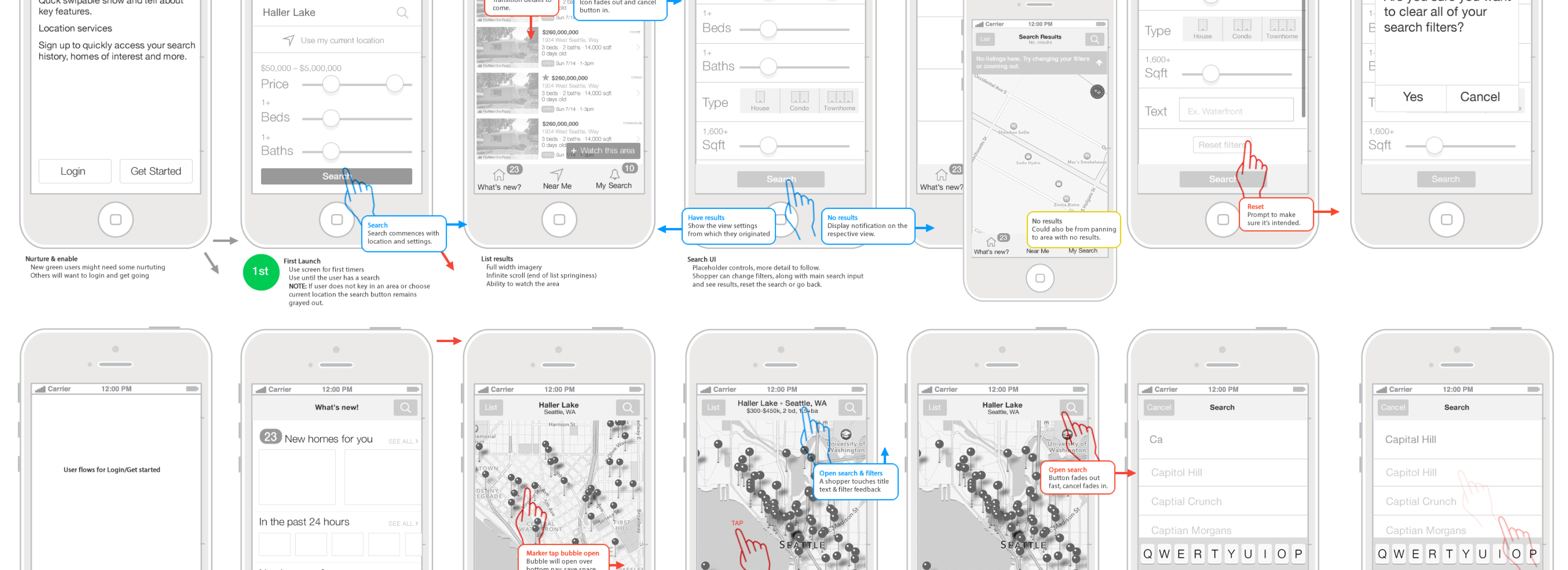
A variety of product directions were considered. After deliberating between a dedicated Open House app or a full featured search application we settled on the latter and began wire-framing.
Process
Inspiration + Fun + Logic
Early in the process of product design and development it's essential to "see" the situation from the customers point of view. This humble point of view becomes the catalyst, driving product decisions and design direction. Another aspect of product design I consider is brand recognition. Persuasion, emotion and trust become building blocks for a young brand. When someone stumbles upon the product it needs to present information in a simple, performant, and reliable format and it needs to have a dash of delight!
Dreaming up ideas is the easy part but before it can become a serious contender I test it. Not AB testing or variation testing (eventually) but "at your desk prove it to yourself testing". If an idea survives my inner voices of scrutiny I present it to the team for final adjustments before it rolls out into production.
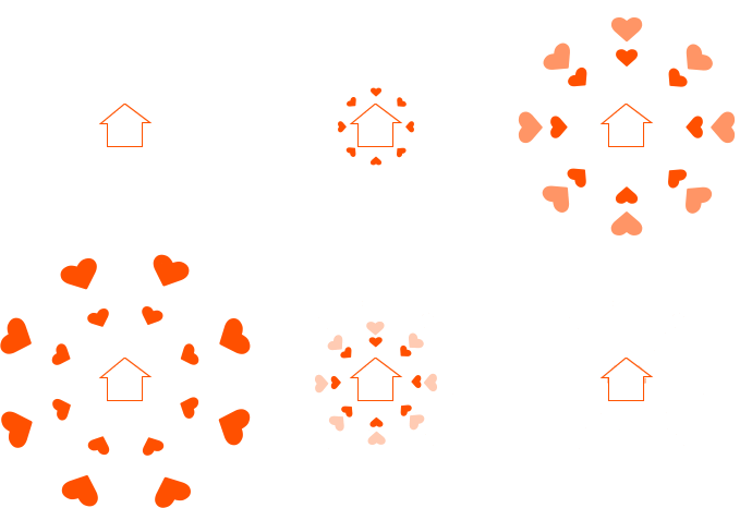

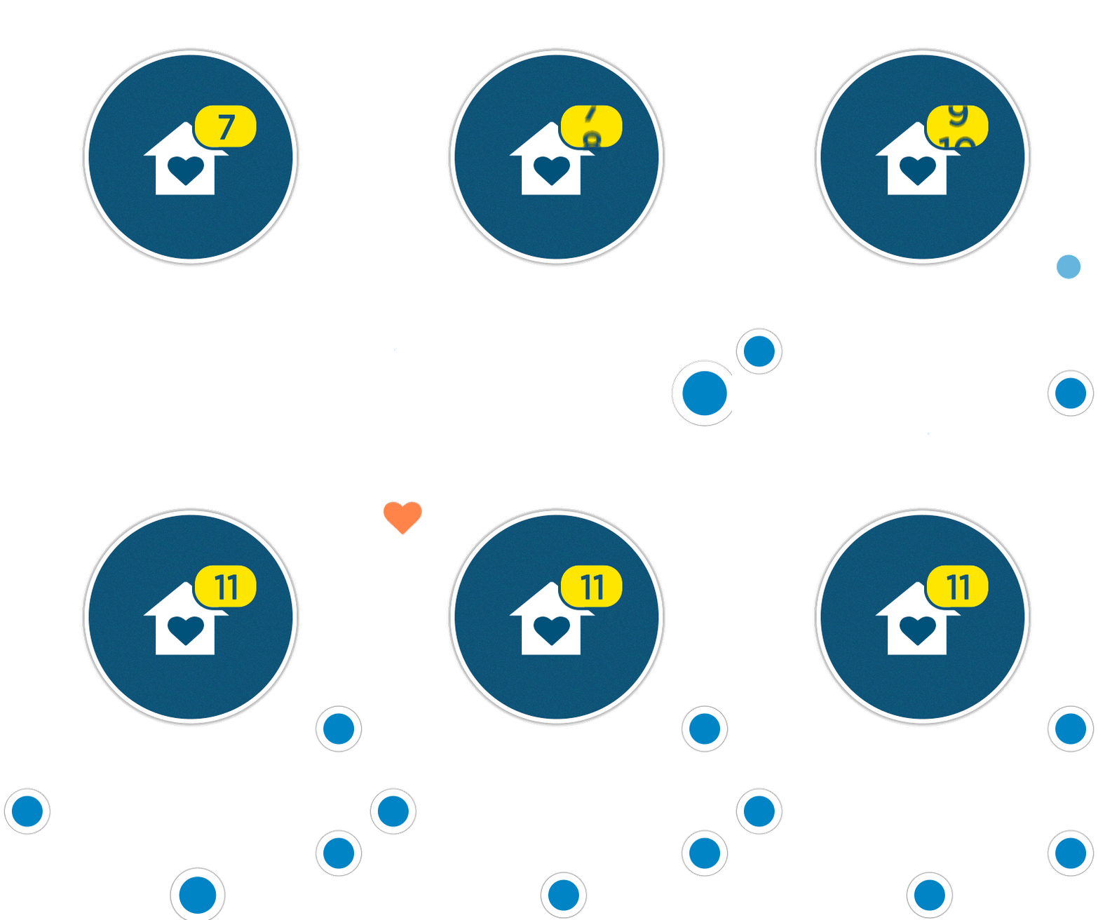
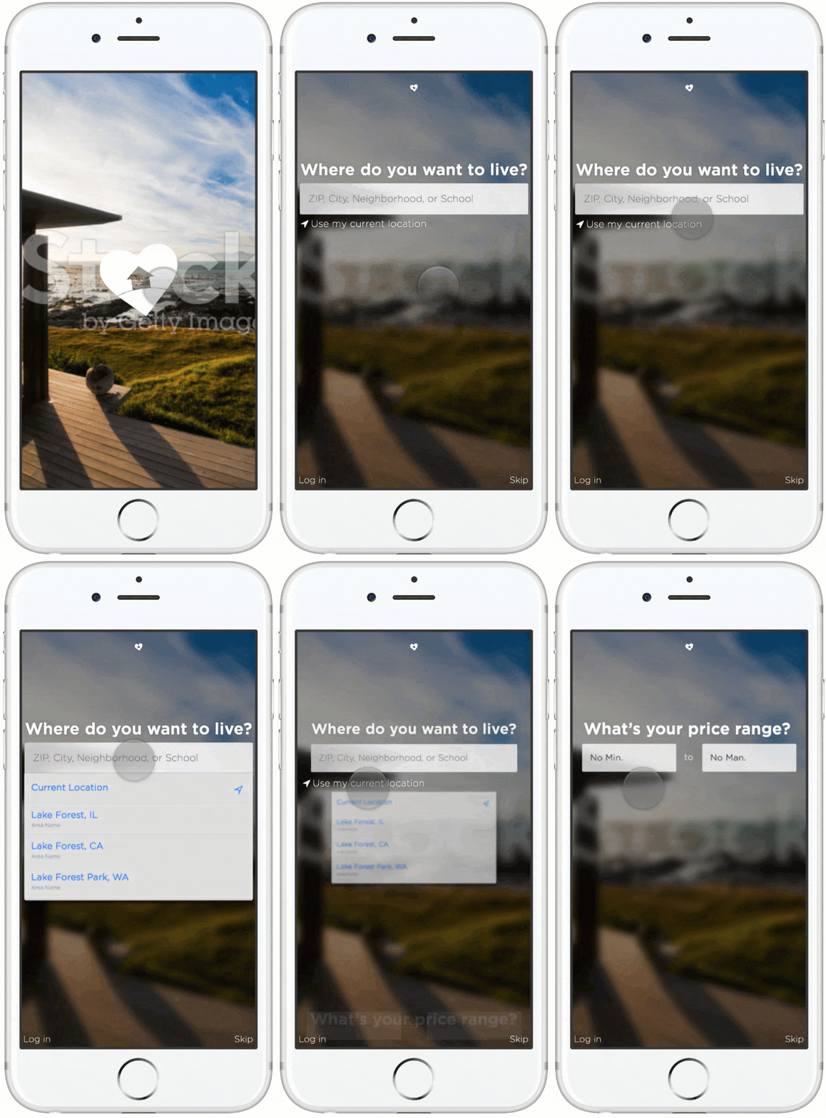
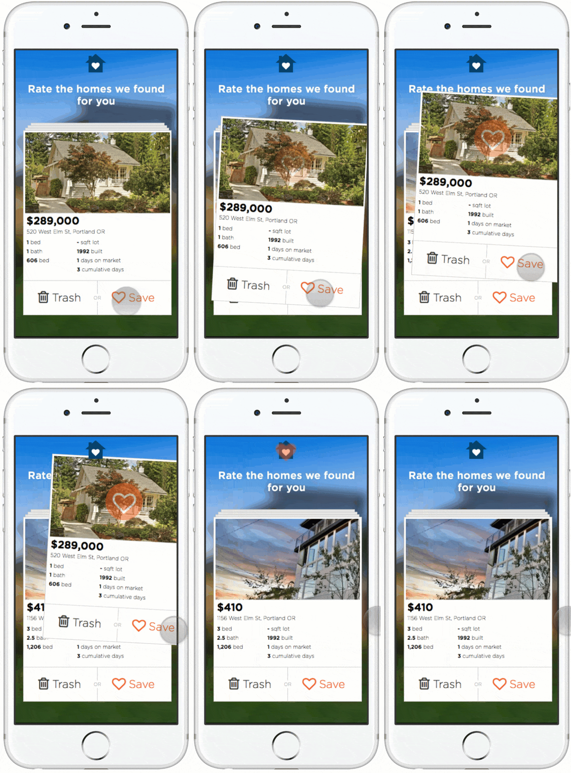
Above: Early animation concepts made with GIFs or Coffee Script. Below: An early study of app on-boarding and cadence to search.

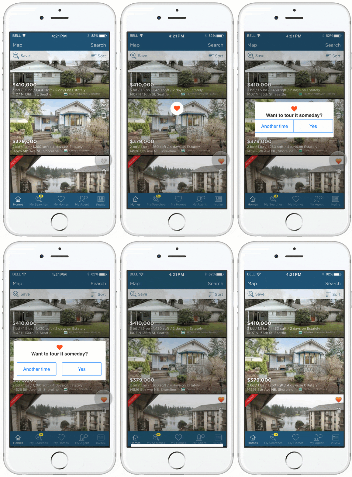
Below: An early concept that ended up being a catalyst for the save animation.

![]()
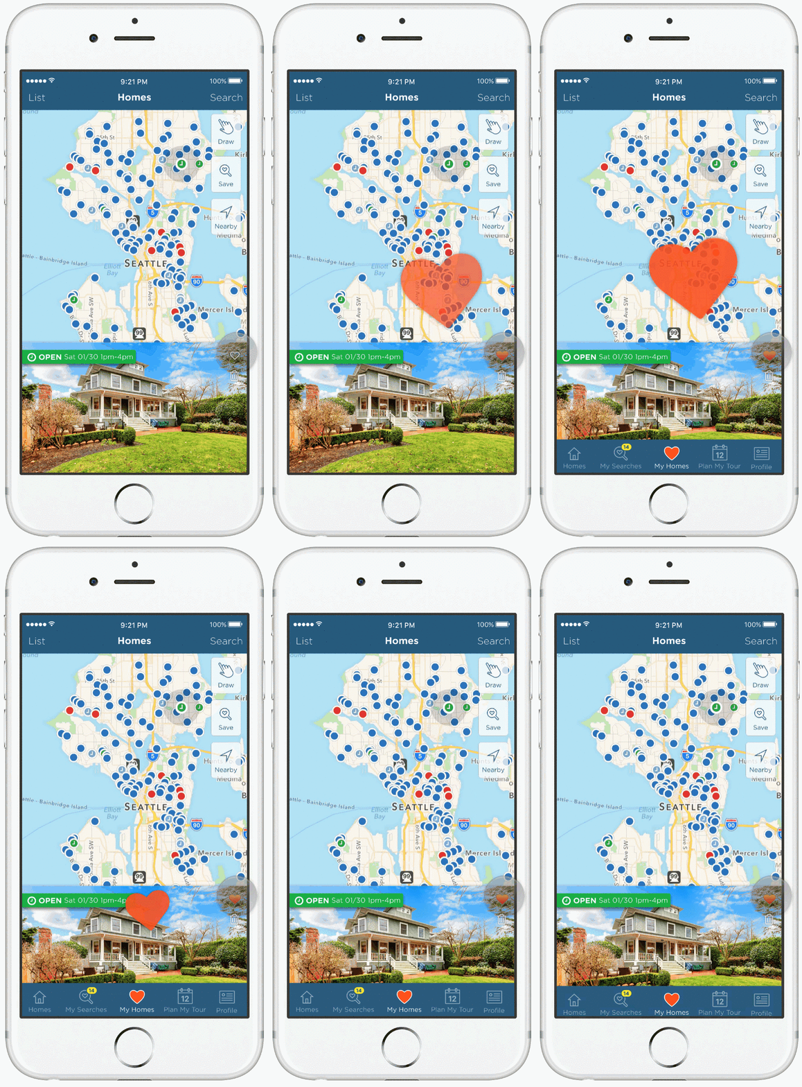
Prototyping animations and small interactions is vital in the process of designing any experience. I begin with a design in Sketch App and then move assets into Framer Studio where I pull storyboard ideas together to share with engineering.
Solution
Elegant and usable
I look at any product as a living organism. There are basic needs required to sustain life and you can’t ignore the impact of each decision.
When the moment arrives where the functional design is released you are no longer there to explain it. Therefore all the ingredients for living and understanding need to be present.
Our data is King. We developed a flow to on-board users so that just about 100% have a basic home search in place and about 50% of our audience have Push notifications enabled. This means we can get users back into the app frequently. Visual design and data infrastructure design work together to built trust that our app and our service are best-in-class.
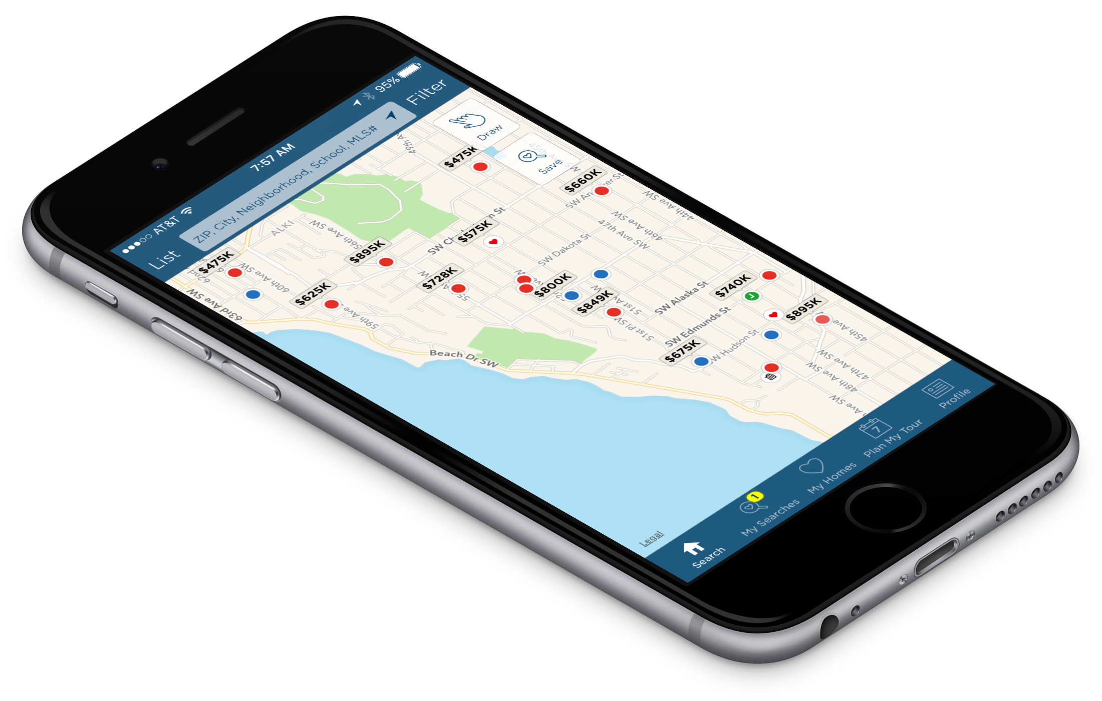
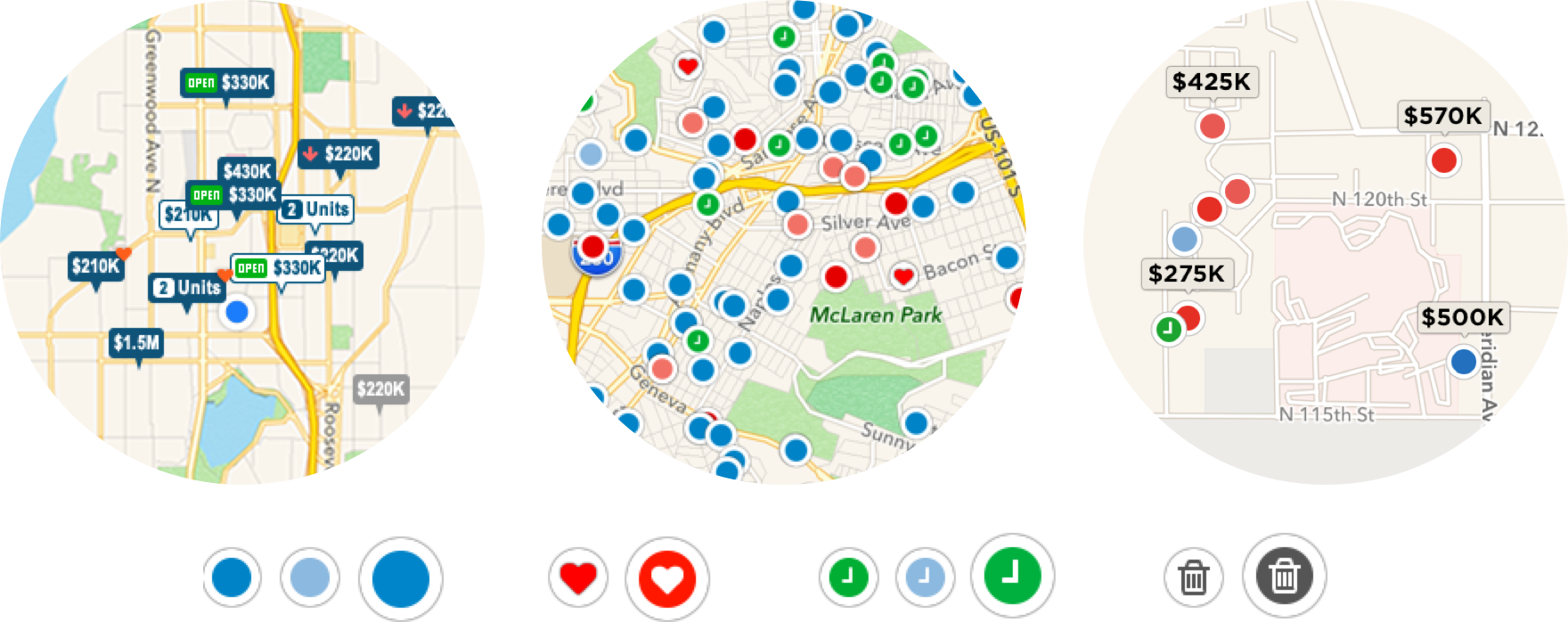
Taking time to explore map information density and explore marker designs paid off. User feedback eventually led us to explore pairing prices with map markers at sensible zoom levels. Markers also refreshed on the map in an organic way that brings life to the map and the search experience.
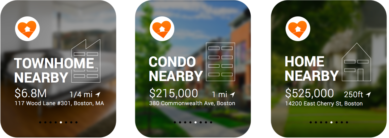
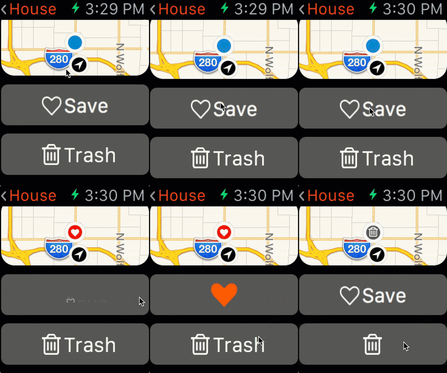
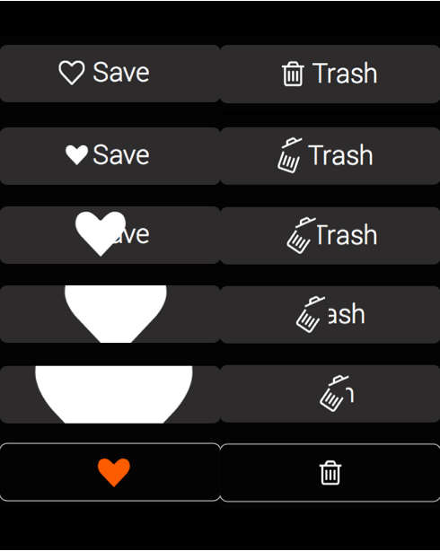
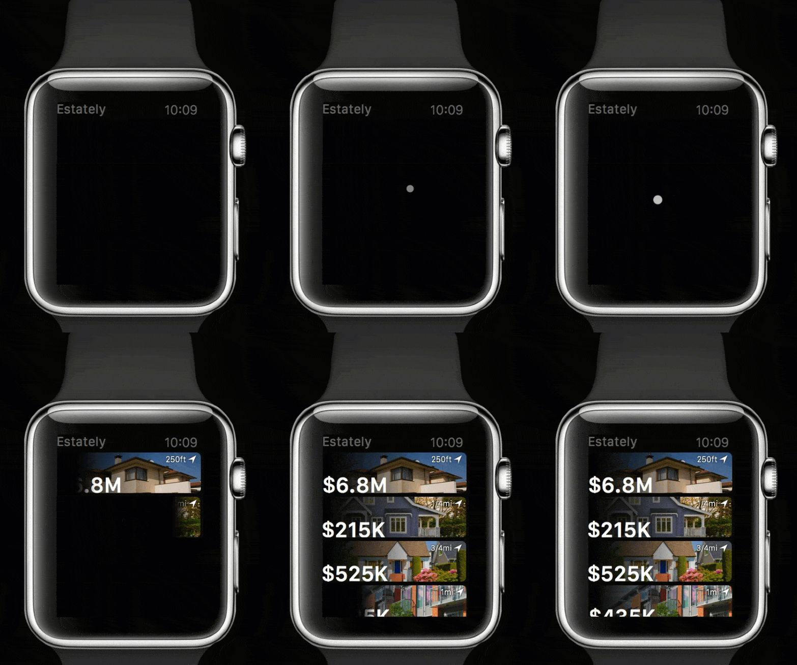
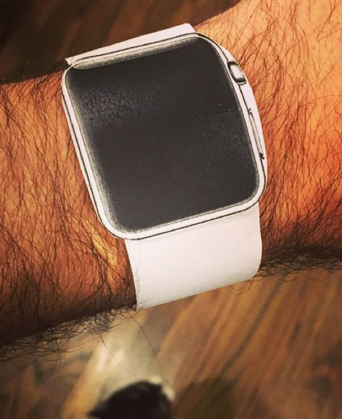
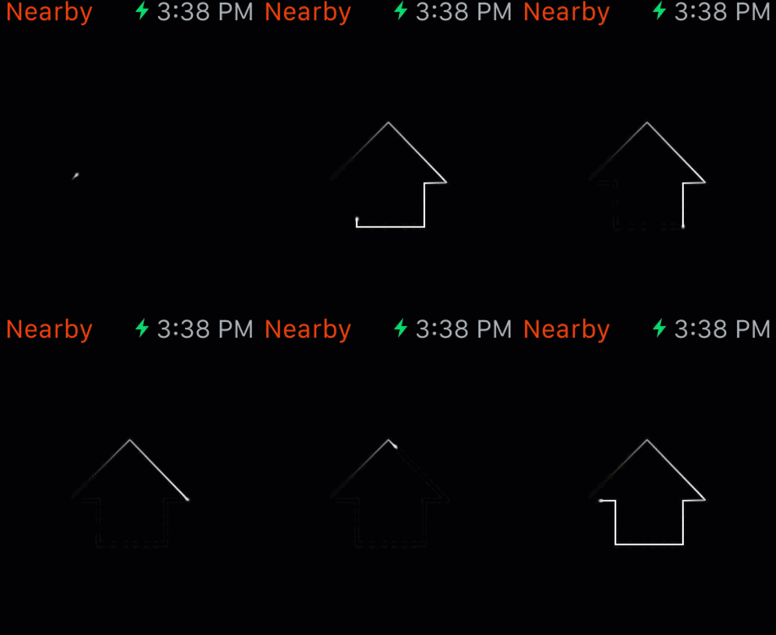
Below: Top Glance screens for Apple Watch App. Bottom left There was a time when Apple Watches only existed on paper. This homemade version gave me a sense of tap area and font size. Bottom right A walk-through of the Watch app.

Results
"When will you have an Android app?"
Native apps have a huge potential to delight audiences and put a huge resource at a persons fingertip. They come with a lot of responsibility. Software updates every 18 months, new devices are added regularly enough that form factor can not be ignored and well designs and code are buggy.
Over the past three years Estately has done an amazing job brining a tremendous amount of data and utility to it’s audience. We retain users better than expected and have approximately a 60% success rate in sign-ups. Five weeks after install the app has over a 35% retention rate. In my opinion this is outstanding considering we have little no investment in advertising our app.
Another anecdotal measure of our success is that we regularly receive feedback asking us when we ill have an Android app.
Love your app! I think I get notifications before my realtor.
I love the notifications on updated listings and new homes from my saved searches! …this is my favorite real estate app for home searching!
I LOVE this app. It is by far the best real estate app out there! It would be nice to have more options with sorting favorites somewhat like you would in the search- sort by price, open house, etc.
